Well, here is an interesting situation. After watching the somewhat strange Strike Witches cartoon, I decided I needed some figures. Not really expecting much to happen about that, I bought this Yoshika Miyafuji figure, which was made by Mobip. They only did the one character as far as I know, which is odd. Anyway later on it appears that Good Smile Company made a figma Miyafuji as well. How very odd. While I had the Mobip version first, I did review the figma one first. Now finally here I have the Mobip version.
What’s the difference?
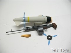
The box is a lot more compact for a start. She comes with her standard machine gun, Striker Units (the plane bits), faces and general stuff for accessories.
An extra fringe and spinning and not spinning propellers. The blue thing in the top left picture is the base for the stand, which is rather large, with three arm bits giving her a bit more height than the figma version. Also in the show, Miyafuji’s power was able to generate a shield and healing. The blue triangle thing can be set as a shield as well as underneath her before she takes off, which is a very nice touch indeed.
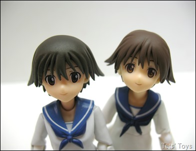
She looks pretty good and close to the show. Her scarf and tie are pliable plastic, the shirt down the bottom is a bit hard though. Here’s a shot next to her figma counterpart.
So Mobip has darker hair and eyes. The figma has a more flowing shirt and more butt showing, Interestingly they have the same joint arrangement, for example, they both have two ball joints at the shoulders, hinge joints in the same areas as well. The hip joints are a little different though, but that is mainly due to the way each company tackled the attachment of the Striker Units.

Mobip Left and figma Right. I think the figma face looks a bit more cartoon like, which is probably more down to the lighter iris colour, but I think I prefer the Mobip sculpt and shape of the face by just a little.
The sculpted details are about what one would expect, in that there isn’t a whole lot. The Mobip one does have a nicer looking neck and chin area, which comes down to the sculpting of the chin, it just looks more natural than the figma one.
This one comes with two faces. Her normal face and a happy smiling one. Yay. They both look rather nice, although the darker eyes on the Mobip make her look less cartoony than the figma.
The accessories are quite nice. I find it interesting that the Striker units are smaller on the Mobip version and I think the rifle is smaller as well. I still like that the Striker Unit looks a bit like an old aeroplane. Very nice.
A little bit of comparison between the figma and Mobip guns. Mobip on the top.
Scale is different. One of them is the wrong size, as both figures are about the same height.
Attaching the Stiker Units is easy. Her legs just pop off and the units just slide one. Mobip have gone for an easier look on her butt over figma and they have also avoided the need for the shift body of the figma as well. As an action figure, Mobip has a nicer butt than figma. Her Shiba dog tail just plugs into a hole as well.
I quite the look of the spinning rotors on this version. The blue just looks a tad nicer.
Popping her angry face and swapping over her fringe gives her her doggy ears. Below is a comparison between the figma neck and Mobip neck and hair as well I guess.
And angry Mobip eyes.
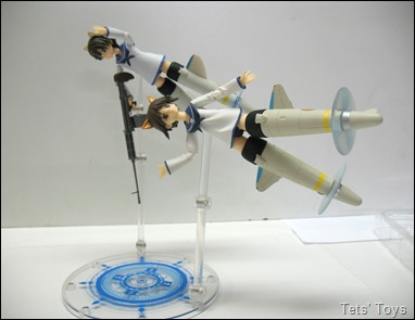
Now the Mobip stand is definitely better than the figma one as not only does it have the magic effect on the base, it has an extra length, so you can get Yoshika up rather high and even have her flying face down but still be high up.
The stand also has multiple plug holes for stands which is great if you want to do the ‘take off’ look for the toy. The smaller Striker Units also aid in posing. She doesn’t have the ‘shift’ body but she doesn’t need one so much as the hip joints are strong enough to hold the units wherever you’d like to place them.
So in the end we end up with a very solid little figure. I bought this one first as I didn’t think that there’d be another action figure of Strike Witech characters made by anybody, and then figma produced some. I don’t really think that one is better than the other really as they both have their strong and weak points. to be honest the difference is negligible in the end. I do prefer the stand of the Mobip Yoshika over the standard figma stand that the other comes with. It has more height and the magic effect on the base looks nice and is adaptable. So in the end, they are both as good as the other.
As a bonus shot, here’s a picture of Drossel.


No comments:
Post a Comment
Comments under moderation until I find around this spam thing.