Well a little bit late for 2012, but here she finally is. Hatsune Miku from Vocaloid, made by the Good Smile Company as she is their mascot for their little racing venture. On a whim I got the 2011 racing Miku and ended up really liking it. It was a more mature version of Miku than what we normally recieve and I dug that. After seeing a statue version of the 2012 version, I decided to get this figma one as well.
Now the collector in me says I should sign on for the 2013 version too. Maaaaann…..
Enough of my slightly OCD characteristics. I think the 2011 is my favourite Miku form. Can 2012 surpass her?
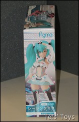
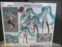
Miku here comes in a standard large figma box. With some nice pictures of her dotted around.
I think she is a bit lighter on accessories this time, coming with a flag, celebratory bottle and an umbrella. The sides of the box have characteristic poses on the side, which will look nice in a bookshelf type display.
A closer look at her goodies. The bottle comes with an effect part of spraying champers which is nice. Stick some flames on it and they can make Bulleta/Bonnie Hood from Darkstalkers. It’s the same bottle shape that came with Reimu Hakurei the priest from the Touhou figma.
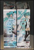
Some box comparison pics between 2011/2012.
You can immediately see a change in the colour focus. The 2012 has a lot more of the ‘standard’ Miku fare going on, more greens and excited happiness about it in a way. Whereas the 2011 version has a simpler ‘racing’ feel to it.
Out of the box, she has two tiers of clam shell covering. Here you can see her lack of accessories.
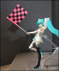
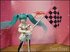
She has a flag (same as 2011, but red and black), an umbrella (same sculpt as 2011) in a closed and open position. The Umbrella has a different paint job and comes with some sticker decals to stick on there. I noticed on the box that her umbrella had some extra colours and was a bit excited but when I found out it was a sticker I was a bit let down. There is only the picture on the box that shows you where to put it and the positioning of the sticker is a bit dubious. Do you set it up so no aqua colour is showing at all? How high should it be? Then you need to hope it goes on easily, but more on that later.
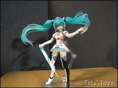
She is shorter than the 2011 version and looks a lot closer to the usual Miku style.. Quite a cute little costume I think.
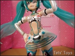
The design is quite good, and even though she looks fairly uncovered, a closer inspection reveals a fair bit of ‘transparent’ coverings around her waist and up the sides.
You can see that she carries pronounced head mounted microphone pieces now that link up to the loop around her pony tails. Annoyingly though (although this is a Miku staple) she still has the little tufts off the back of her head by her neck, which always hinder the head movement, stopping her from looking up much.
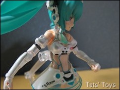
Nice to see that they have included her little Neck tie in the costume design, as well as the sides having the darker shade to represent some covering along the sides and over her shoulders. I really like that it and looks very nice. Her stomach, shoulders and lower back are still exposed, but it fits in fairly well with the Japanese impression of the ‘Race Queen.’ Her bust has shrunk since the 2011 version and the face looks younger as well. She has an impressively clear painted “Good Smile Racing” logo on her breast, as well as a “Crypton” logo on her skirt.
The skirt is also a free moving piece that can be shifted a little bit for effect if you desire.
Speaking of the skirt, it has a nice almost ‘laser’ type look to it. It wouldn’t look that out of place in Tron for example. Which considering how Miku is a virtual idol, is appropriate I think. Her legs have a pair of two tone stockings on, black on the inside and whit on the outside of the leg. Little red dots on the feet and her thighs with grey and blue up near the top.
They seem extremely busy, especially when you look at her shoes, which have the aqua on the sole and heel. They don’t look bad as such, but I think they would have been a bit better if a colour was dropped somewhere. Perhaps if they were all grey? I think what seems odd to me is that although black features around her costume it is most prominent, almost overbearing on her stockings. Nowhere else does it come across sot strongly.
Miku’s hair has a nice transparency as you get towards the end of her pony tails, her fringe is a standard looking fringe and she has a thing that looks like a squashed alien head on the top. Is it a crown of some sort? All I see when I look at it now is a squashed alien’s head…
She also comes with two faces. One is a winking face and the other with a happy open mouthed face. Although I am not entirely sold on these two (I would have liked one other face) I do really like the two tone colour they have made for her irises. It looks really really good!
She naturally comes with a bunch of extra hands for various poses. While I am on the limbs, I will add this right now. They have done and excellent job on painting her arms. It has a nice little shine that gives off an impression of classy silk gloves. I also dig the way the sleeve up by her shoulder is puffy. Definitely cute and pricess-ey!
She comes with closed fists, two pointing hands (like the wiggles) and a couple of open hands. One of the open hands is slightly curved for holding the bottle of champagne.
Or it can also be used for amusing shots.
She also comes with opens hands and hands for holding the umbrella.
Naturally I wanted to use her as and Umbrella Swordsman (or woman as it is…)
Now despite me using the stand for her throughout this whole shoot, she can stand pretty well by herself, which I was surprised at considering how she has high heeled shoes on.
Oh My looks like rain. Or maybe sun.
You can see how much of a pain it was aligning that sticker properly… Luckily the umbrella only needs two and you get four stickers. There is a shot with the 2011 umbrella as well. Sadly the open umbrella is rather heavy and it’s hard to have her hold it without leaning it on her shoulder/ hair.
Her flag on the other hand is much easier to set up.
If you have last year’s one you can make her a signal waver.
The bottle is simple, but effective.
The spray is an extra bit that jut plugs into the top. Now she can got have a Party with Reimu and Suika!
That covers her accessories.
Now onto her PANTSU!
In and interesting change of pace, her pants are not her usual shimapan. They are tastefully done in the ‘boy leg’ style of ladies pants. I am showing off more knowledge than I should aren’t I?
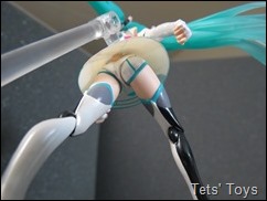
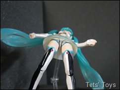
They have them set up so that they cover the joints of the hip really well and they are a bit shiny too. Satin pantsu? The only real downer is that above her pants there is a funky looking nub thing that her skirt is attached to (best seen Bottom left picture). Now it’s only weirdos like me that will go to this extent, but it is a bit ugly. However unless you are really peering up her skirt, then it’s not noticeable. And I guess it keeps the skirt angled the correct way. I actually quite like this style of pants. They are nice, not too pervy with a bit of class (for pantsu), which is a relief since the front of her skirt is translucent.
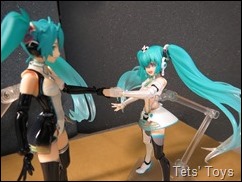
Now for some comparison shots with her next to 2011 Racing Miku.
2011 is a bit taller and more mature looking. This is accentuated by the design of 2011’s face over that of 2012, her bust size and height. 2012 has larger eyes for example. The design of 2011 seems a lot simpler however it is also a lot less Miku-like.
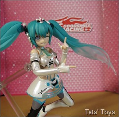
I also got this little telephone accessory thing as well. It seems that the winking salute is 2012’s signature pose. I added in some Wiggles finger pointing action for good measure. After all she is stage girl…
(The sign comes from the 2011 version)
I must admit that when I first saw the designs for 2012 Racing Miku I was hesitant. I really liked the 2011 version and this one didn’t quite grab me. I dilly dallied for so long I had to go through a third party to get one, but it wasn’t that expensive and after having spent some time with her I am glad I did.
The design is cute, tasteful and a return to Miku-ness for the Racing version. There are lost of nice little touches there such as the little neck tie that remind you who she is just by looks alone ( I guess that can’t be said so much about the 2011 version), the pearlescent paint on her gloves and the great two tones irises. While I still prefer the 2011 version over this one (I suspect this is because it is so different to the usual Miku design), this one has certainly grown on me and I like it quite a lot. It gives off an air of exuberant cuteness, which I think is what I get from Hatsune Miku, whereas the 2011 gives an air of controlled sexiness.
I know look forward to seeing the design for the 2013 version. From the promotional images I have seen so far (not actual toy pics though), it looks like they have taken a few cues from the Append version of Miku. Interesting…























No comments:
Post a Comment
Comments under moderation until I find around this spam thing.