
Yes! that’s right! In case you couldn’t tell, this is a little gallery and review of the figma version of Yoshika Miyafuji from the awesome, possibly asinine, definitely ridiculous Strike Witches. This story has a funny(ish) way of coming about. One day while perusing DVDs, I saw the cover for the box set of season 1 of Strike Witches, and it’s tag line was “Winning the war on pants!” which immediately got my interest. What does that even mean??
A short bit of googling later and I discovered Strike Witches were a bunch of girls who have WWII era aeroplanes (of sorts) attached to their legs. According to Wikipedia, the anime uses real WWII plane formations as well. That was enough for me, so I got the first season on DVD.
And story wise it was and still is complete tripe (there was a whole episode on one girl wearing another’s pants and that was the whole premise. Disappointingly the enemies and battle sequences were lacking and I found it a bit of an effort to get through to be honest). But I still like the aesthetics of the characters and the ‘mecha-musume’ genre it has going on. Mecha-musume is a Japanese term and translates to “robot daughter” but the general theme is pretty close to a cyborg sort of effect.
Some more googling and I have discovered that Yoshika is named after pilot Mutou Kanayoshi, her striker unit is based on the Mitsubishi Zero A3MBa, (ar, the good old Zero fighter, gave the Americans a fair bit of trouble until they found a crashed one, if I remember correctly, they were made with wooden frames to keep them light) and her gun is a Type 99 13mm submachine gun.
So onward with the yabble about the toy. Usual figma box.
It has the logo of the 501st division on there, which is the division of the army to which Yoshika here belongs. You can see all the accessories, aside form the stand and extra hands. The sculpting of the ‘Striker Units’ (aeroplane bits) looks good in the box and the gun made me go ‘Wooo!’ when I first saw it as well.
And now a look at the packaging on the inside.
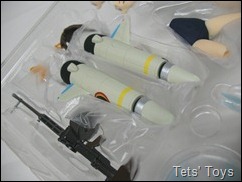
In a rather morbid display, we can see that she has her units next to her rather packing gun. You can see in the first photo an extra waist and legs. A little bit odd, but this is her ‘shift body’ which we will look at later. The figma that came with the Queens Blade Spiral Chaos game, Cute, also has a shift body. For another reason. Usual spare figma hands and faces and a couple of propellers for the units. One for when the prop isn’t spinning and one to simulate a spinning one. Please note, that as they are magical propellers, they don’t appear on an un-used Striker Unit.
Final accessories are a fringe with ears and a tail, for when she is using her majiks (or magic). All the Strike witches have a theme animal. Yoshika’s is the Shiba-inu dog. Famous in Japan thanks to a dog name Hachiko, which a statue of can be seen outside the Shibuya train station. Probably Japan’s favourite breed of dog.
Yoshika herself is sculpted pretty well. The thing with Strike Witches is they don’t have any pants on, for whatever reason, which is never fully explained. Although it could be related to the striker units, but why they don't wear leggings instead is a mystery. Anyway, who cares about logic here? Which is good, because they would probably get pretty dang cold if logic got involved.
Yoshika’s uniform is comprised of the following items:
- Japanese School swimwear.
- Japanese School blouse.
Both are sculpted well and the shirt/blouse has a flowing wind blown look to it, appropriate and a good touch. Why she gets around in swim wear all the time, is again, a mystery. I like her shoes, simple, tennis looking sneakers, sculpted with laces. Her scarf is light pliable plastic as well, so as not to inhibit the shoulder movement and is painted sharply and looks good.
The blouse is flowing and whether this is to simulate flying in the wind, or just a chance to get a better view of her butt, is open to debate… The back of the scarf is as well painted as the front.
The rim of the blouse however is not so sharply painted.
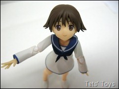
The sleeves of the blouse are flowing and large as well. Her face is well sculpted and looks particularly close to the anime and she has three of them to use, happy, embarrassed and angry.
Those open hand in the picture above are an extra set that have been made. They are kind of handy for amusing poses, but otherwise tricky to bother with. Her head also has a great range of movement, ever since having a little play with a Miku figma (and Chogokin version now that I think about it), I have been conscious of head movement, since Miku couldn’t look up. That is important for Yoshika, as she has to look up for flying poses. The hair looks really nice and is a good colour as well.
 Her waist can be pulled out of the shirt which is needed to swap to the shift body.
 You can then see the quality sculpt on the body. No rude bits, after all, she is a kid.
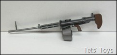
Being a bit of a WWII buff, I was drawn to her gun.
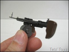
Plus the cartridge underneath is Tommy-gun-esque and Tommy guns are always awesome. It is a Type 99 13mm machine gun.
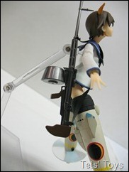
It is a good size, even though it is large for Yoshika, she was always small which I think was part of the point and she takes the role of a healer anyway and so rarely uses the gun, or it’ a last resort sort of thing.
It has a flip up sight on it, which is pretty cool and also a cloth strap so you can hang it off her.
I was impressed with the paint on the gun, it’s colours are great, the metal grey works well and it even had a little bit of solver paint on the bottom of the part the goes into her hand ( I forget what it’s called now…)

The Striker Units. These give the witches the ability to fly (although they can do it un-aided, it is harder apparently) and are based on real aeroplanes. As I said before Yoshika’s is based on the Mitsubishi Zero. These look pretty cool and have lots of cool sculpting on them and one wing on each.
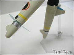
The black with the crescent moon is the symbol of the ‘Fusou Empire’ (Japan in this alternate WWII time). The black ring at the end of the unit can be removed, as it adequately fills the space where the propeller goes when the unit isn’t on.
Looking at the unit pic on the right, you can see how the profile looks like a fighter. The end where the legs go into is painted black and the figure comes with an extra piece of paper telling you to be careful when attaching the unit, as the black can mark the legs. And they can…
Inside the top of the unit is a peg that is hinged. This allows the units to fit on the legs. you need to take off the legs below the knee, removing the joint as well and slide the units over the thighs. The peg in the unit goes into the hole where the knee joint plugged in.
Good idea, but a bit annoying. the peg keeps folding down and on one of her legs, the peg doesn’t attach hard enough, so the unit is always falling off. The other leg is fine though and please be careful, as the paint does mark the plastic of the thighs. Ever since I have made getting human characters for my collection (specifically Revoltech and figma), I have come across the annoying fact that although the skin tones look ace, the slightest bit of dirt on your fingers will leave a mark and is bloody hard to get off. This is the same, only easier than normal. I would have preferred perhaps swapping the entire leg, or having the black part of the unit made from a different type of plastic.
OK, so now the units are on, let’s see her fly!
This is a shot of the motionless propeller.
And the props in motion, they look pretty cool.
Once she is using magic, you need to add the new fringe with ears and her Shiba tail(for canonical accuracy), which is as easy as swapping the fringe and plugging the tail into her lower back.
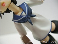
Now the flowing shirt effect really comes into play.
Her ear fringe is well done, and the tail has some nice paint on it as well.

Angry face!
Now onto the shift body.
Why the shift body? Well, there were statues of Yoshika made and they kind of defined a certain pose for her, and the shift body, being a solid piece of plastic helps in making the pose more aesthetically pleasing.
 With the shift body, you can make her look like this.
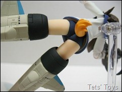 And her butt looks like this.
 Instead of this.
Man those joints look ugly there. I guess the shift body was an easy way around the hassles of the joints, but combine that with the marking on the thighs from the striker unit and there should be an alternate way.
More shift body pictures.
Combine them with her legs and you can make some nice ‘tripping over’ shots.
Oh and you may notice that in many of the pictures, her dog tail isn’t actually showing. the reason for that is due to it needing to be plugged into her but but a little ball joint. Sadly, like her unit, the tail just keeps bloody falling off. Mucho annoyingo!
Ok, to sum this baby up. yet another pretty good figma, probably only let down by the Striker Units marking the thighs when you take them on and off, so please be more careful than I have been (so extremely, incredibly, unbelievably careful). Good sculpting and poses can be made. I juts wish that she had a bigger stand than normal, as it’s hard to get a good horizontal flying pose. I look forward to the next figma Strike Witch that comes out, who I can’t remember the name of, but there is one on the way. Hopefully Luchini is next!
Luckily I have another Yoshika with an excellent stand. And the looks similar too. Before figma whipped one out, the Mobip Yoshika was made. Quick comparison shot follows.

Mobip on the left and figma on the right. Already have the photos and so will do a quick review and compare later.
And now for the fun pics.
Mainly involving those extra dodgy looking hands…
“Ur hur hur hur!”
Drossel doesn’t want this kid anywhere near her.
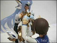
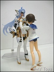
Kos-Mos on the other hand wasn’t quick enough.

Could this be Yoshika when she grows up?
*Sporting Kos-Mos’ legs. (and butt)

It was at this point in his life when Sy-Klone started thinking that the move from American cartoons to Japanese cartoons wasn’t such a good idea.
Or was it? His emotions were conflicted…













No comments:
Post a Comment
Comments under moderation until I find around this spam thing.